Vail Grant Residence – California.

Friday, February 5, 2010


Topography sculpted of folded, skewed metal planes; the Vail Grant House seems to enter into a love affair with its hillside site, blurring the boundaries between the natural and the artificial. Although the building appears to be a direct response to the topography, much of its shape actually derives from a translation of the complex setback and step back requirements of the hillside ordinances as they relate to this site.


The zoning codes require a lower building height towards the street and permit a taller structure further up the hill. By that means, it was possible to build relatively close to the street and establish a relationship to the smaller scale in the surroundings, while being able to increase the height further back in the lot—thus taking advantage of the spectacular views.

Although the Vail Grant Residence is situated on a hillside with a 66 percent grade, the architect derived its shape from setback ordinances imposed by local zoning. The house's main volume is a square that has been extruded into an elongated, twisted box that projects into the hillside. Its roof is folded; creating a series of voids and volumes that enable occupants to inhabit the house and simultaneously view it from within—the observer becomes the object of his own observation.

The building volume is created by a simple extrusion of a square, a neutral elongated twisted box that is projected into the site and sculpted along its contours. The folded roof is skewed where to allow directed views or openings. The building’s movement on the site describes a spiral that begins at a lower point closest to the street, travels up the hill, and then turns back towards the street and the lake, overlooking itself and creating an enclosed court in the center.


The architect's (Pugh + Scarpa Architects) main challenge was how to construct an exciting, yet economical design on an difficult site. The solution involved using Structural Concrete Insulated Panels (SCIPs), which are less expensive and easier to install than typical cast-in-place, formed concrete walls. The structure was developed as an exoskeleton against the earth with the inside forms and spaces defined by light gauge cold-rolled steel that can be folded and penetrated as necessary. The architect intentionally limited the building width to 15 feet to reduce spans and further simplify construction.


The Vail Grant House distinguishes itself from most conventionally developed projects in that it incorporates energy efficient measures that exceed standard practice, optimize building performance, and ensure reduced energy use during all phases of construction and occupancy. The planning and design emerged from close consideration and employment of passive solar design strategies. These strategies include: locating and orienting the building to control solar cooling loads; shaping and orienting the building for exposure to prevailing winds; shaping the building to induce buoyancy for natural ventilation; designing windows to maximize day lighting; shading south facing windows and minimizing west-facing glazing; designing windows to maximize natural ventilation; shaping and planning the interior to enhance daylight and natural air flow distribution.


Furthermore, the building width was intentionally limited to 15’ throughout, reducing spans and simplifying construction. Solar panels placed on the slope behind the house produce enough energy to make this a completely self-sustained building. Small diameter pipes are inserted into the hillside and thru the SCIP panels bringing 60 º C air into the building for natural air-conditioning. The large viewing window also allow the sun to heat the adjacent interior concrete slab creating natural convection that rises up the interior space and is vented at the uppermost portions of the building. This will allow natural airflow for both natural cooling and solar radiant heating. When completed the Vail Grant Residence will be 100% energy independent.By responding to the visceral aspects of the site, both physical and regulatory, a unique sustainable and economic design was achieved.

Organic Architecture

Wednesday, February 3, 2010


The term "Organic Architecture" was coined by the famous architect, Frank Lloyd Wright (1867-1959), though never well articulated by his cryptic style of writing:

"So here I stand before you preaching organic architecture: declaring organic architecture to be the modern ideal and the teaching so much needed if we are to see the whole of life, and to now serve the whole of life, holding no traditions essential to the great TRADITION. Nor cherishing any preconceived form fixing upon us either past, present or future, but instead exalting the simple laws of common sense or of super-sense if you prefer determining form by way of the nature of materials..."
- Frank Lloyd Wright, an Organic Architecture, 1939.


Organic architecture is a philosophy of architecture which promotes harmony between human habitation and the natural world through design approaches so sympathetic and well integrated with its site those buildings, furnishings, and surroundings become part of an unified, interrelated composition.

The philosophy grew from the ideas of Frank Lloyd Wright's mentor, Louis Sullivan, who believed that "form follows function", Wright argued that "form and function are one." and the Art Nouveau architects of the early twentieth century incorporated curving, plant-like shapes into their designs. But in the later half of the twentieth century, Modernist architects took the concept of organic architecture to new heights. By using new forms of concrete and cantilever trusses, architects could create swooping arches without visible beams or pillars

Organic Architecture is also translated into the all inclusive nature of Frank Lloyd Wright’s design process. Materials, motifs, and basic ordering principals continue to repeat themselves throughout the building as a whole. The idea of “Organic Architecture” refers not only to the buildings' literal relationship to the natural surroundings, but how the buildings' design is carefully thought about as if it were a unified organism. Geometries throughout Wright’s buildings build a central mood and theme. Essentially “Organic Architecture” is also the literal design of every element of a building: From the windows, to the floors, to the individual chairs intended to fill the space. Everything relates to one another, reflecting the symbiotic ordering systems of nature.

New Organic Architecture is a manifesto for building in a way that is both aesthetically pleasing and kinder to the environment. It illuminates key themes of organic architects, their sources of inspiration, the roots and concepts behind the style, and the environmental challenges to be met.

The organic approach to architecture has an illustrious history, from Celtic design, Art Nouveau, Arts and Crafts, to the work of Antoni Gaudí and Frank Lloyd Wright. Today there is a response to a new age of information and ecology; architects are seeking to change the relationship between buildings and the natural environment. In the first part of his book, David Pearson provides a history and assessment of organic architecture. The second part comprises statements from thirty architects from around the world whose work is based on natural or curvilinear forms rather than the straight-line geometrics of modernism. Each statement is accompanied by full-color illustrations of one or several of the architects' built projects.

Modern Materials and New Techniques.

Tuesday, February 2, 2010


Never in the history of architecture we have noticed so radical changes as in its construction and planning. Due to the population explosion, new developments occurred in almost every field of human endeavor. But these developments were nowhere more wonderful than in the field of architecture.
Stone, bricks, timber and tiles are of course materials which, from time immemorial, have been greatly used in the construction of buildings, large or small, single or complex and are still employed structurally in the traditional way.

The wonderful modern architecture considerably improved and superceded all the old styles in variety and design with invention of new materials and new techniques.
Steel found to be the most suitable structural material for framing of huge cellular buildings. It also helped to produce greater uninterrupted spans over openings. In the beginning the steel was used as truss members but soon the age old method was given up. The new technology helped to use it over great halls in unified frames composed of three dimensions. Steel members rolled in variety of shapes such as plates, angles, I – beams, etc. are joined, riveted and even welded. This resulted into rigid continuous structures thus producing a fundamental change in architectural design.


The use of reinforced cement concrete has produced distinctly new breed of buildings such as sky scrapers. Massive stone walls are now replaced by thin R.C.C. curtain walls thus producing larger interior spaces. Roofs have taken wide range of shapes from flat to flat to barrel vault, to shell roof; hemispherical domes to hyperbolic paraboloid domes.

Pre stressed concrete has helped beyond imagination in the construction of bridges and hangers of Air Ships etc. Glass transparent to ultra violent (for growth) rays but opaque to infra red (heat) rays are extensively used instead of shades, blinds and curtains. Sheets of one way glass (one can see out, but outsiders peeping Toms cannot see in) are largely employed in windows.

Lamination, consisting of glued layers of wood, has helped to form beams and arches to cover a large span than the natural wood. Plywood and other thin boards enable us to cover large surfaces without extensive frame – work.
Chromium and stainless steel which successfully resist the atmospheric influences are largely used.
The plastics are available in wide range of beautiful colors. They are almost all – proof and available in the form of sheets, rods, rolls and pipes.

Infosys – Pune

Sunday, January 31, 2010

On approach to the Infosys campus, the buildings that steal a glance and demands for several glances are the software development blocks.


The two elliptical shaped buildings standing high in the premise, leading one to a completely different world. Another signature design by Architect Hafeez Contractor for the software development blocks – 3 & 5.the concept derived for designing this building have been inspired by germinating seeds, which meant to epitomize the idea of evolution. Tapering columns that support the structure at the ground level along with usage of other modern day materials like metal framework, metal purlins, double-glazing and most importantly Kalzip. The extensive glazing with its clearness allows one to move through the interior spaces revealing its vantage points that illustrate the dynamic interiors of the building. The double height entrance lobby has glass elevators that enhance the experience of transparent atriums offering expansive vistas of the outdoors. The office spaces of the 1st and 2nd floor overlooks the clear glass entrance plaza. The remaining three floors take the shape of the structure, diminishing towards the top.


Between the two elliptical SDB lies the food court. This food court was designed to cater 1500 people at a time. The site for the food court was an undulating one due to which the design concept thought over by Mr. Contractor was to move with the flow in stepped form. The main point that arouses interest is that this building is not air-conditioned but has special air cooling system. The glazed walls are sliding in nature. The food court, though is an informal building but it has been designed with firm rectilinear lines, with vibrant pastel shades for the interiors.


The Progeon buildings are the BPO buildings located opposite to the food court and SDB 3 & 5. The outlines of the buildings have crisp rectilinear lines, unlike the SDB buildings. Externally, the simplistic geometry oriented is incredibly powerful expression of technologically advanced facility. Based on the requirements provided by Mr. Pei, Infosys, of which the most important ones were:

a. Ease of construction in short time duration and,
b. One should be able to move through the building, through the central corridor, provided on either side of the core.

Another demand in the list of requirement was for the food court for staff, which has been designed at the topmost level with 800 seating space and self-sufficient kitchen. As one side of the core has been transformed into food court with room height of 7 mts., the other side of the core remains the corporate zone. The floor plate being 60,000 sq. ft.for Progeon allots 80 sq. ft. to every staff.

Last but not the least is the ECC building i.e. Employee Care Centre. Having been provided with a narrow patch of land, the rectilinear mass stands out with circular bands provided at intervals to break the monotony of the structure. This building is one of the tallest one in the premise.

The design of this building was done keeping in mind the three major activities like training, recreation and accommodation.


The building has a central double height entrance lobby with a glass canopy. The entrance lobby divides the floor having facilities like swimming pool, gymnasium, Indoor badminton court, squash court serves as a place breakout after extensive training on one side where as on the other side is the office area, training hall and lecture hall, auditorium, conference room, foyer - as a breakout area in between the conference room and lecture hall.
A mini super market was designed within the building keeping in mind the general and daily needs of the occupants.

Finally, for the accommodation facility, the upper level of the building has been planned with single and double occupancy rooms for women and gents and suites for special guests and families. There are 1000 rooms in total. The accommodation facilities have been designed on the upper levels to provide the occupants a soothing view of the surrounding areas and to allow them to enjoy the pleasant climate of the place.

Thus, all four different types of buildings are very different in design from one another, and each of them stands defining its functions through its unique aesthetics.

Optical Illusion of Parthenon, Athens.


Many optical illusions are found in architecture and, strangely enough, many of these were recognized long before painting developed beyond its primitive stages. The architecture of classic Greece displays a highly developed knowledge of many geometrical optical illusions and the architects of those far-off centuries carefully worked out details for counteracting them. Drawings reveal many optical illusions to the architect, but many are not predicted by them. The ever-changing relations of lines and forms in architecture as we vary our viewpoint introduce many optical illusions which may appear and disappear. Any view of a group of buildings or of the components of a single building will exhibit some optical illusions. We never see in the reality the same relations of lines, forms, colors, and brightness as indicated by the drawings or blue-prints. Perhaps this is one of the best reasons for justifying the construction of expensive models of our more pretentious structures.
No detailed account of the many architectural optical illusions will be attempted, for it is easy for the reader to see many of the possibilities suggested by preceding chapters. However, a few will be touched upon to reveal the magnitude of the illusory effect and to aid the observer in looking for or recognizing them, or purely for historical interest. In architecture the eye cannot be wholly satisfied by such tools as the level, the square, and the plumb-line. The eye is satisfied only when the appearance is satisfactory. For the purpose of showing the extent of certain architectural optical illusions, the compensatory measures applied by the Greeks are excellent examples. These also reveal the remarkable application of science to architecture as compared with the scanty application in painting of the same period.
During the best period of Grecian art many refinements were applied in order to correct optical illusions. It would be interesting to know to what extent the magnitude of the optical illusions as they appeared to many persons were actually studied. The Parthenon of Athens affords an excellent example of the magnitude of the corrections which the designer thought necessary in order to satisfy the eye. The long lines of the architrave - the beam which surmounts the columns or extends from column to column - would appear to sag if it were actually straight. This is also true of the stylobate, or substructure of a colonnade, and of pediments and other features. These lines were often convex instead of being straight as the eye desires to see them.
In the Parthenon, the stylobate has an upward curvature of more than four inches on the sides of the edifice and of more than two and a half inches on the east and west fronts. Vertical features were made to incline inward in order to correct the common appearance of leaning outward at the top. In the Parthenon, the axes of the columns are not vertical, but they are inclined inward nearly three inches. They are said also to be inclined toward each other to such a degree that they would meet at an altitude of one mile above the ground. The eleven-foot frieze and architrave is inclined inward about one and one-half inches.
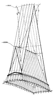
In Fig. 85, a represents the front of a temple as it should appear; b represents its appearance (exaggerated) if it were actually built like a without compensations for optical illusions; crepresents it as built and showing the physical corrections (exaggerated) in order that it may appear to the eye as a does.
Tall columns if they are actually straight are likely to appear somewhat shrunken in the middle; therefore they are sometimes made slightly swollen in order to appear straight. This outward curvature of the profile is termed an entasis and in the Parthenon column, which is thirty-four feet in height, amounted to about three-fourths of an inch. In some early Grecian works, it is said that this correction was overdone but that its omission entirely is quite unsatisfactory. Some authorities appear to believe that an excellent compromise is found in the Parthenon columns.
One of the conditions which is responsible for certain optical illusions and has been compensated for on occasions is represented in Fig. 86. On the left are a series of squares of equal size placed in a vertical row. If these are large so that they might represent stories in a building they will appear to decrease in size from the bottom upward, because of the decreasing projection at the eye.
Many optical illusions are found in architecture and, strangely enough, many of these were recognized long before painting developed beyond its primitive stages. The architecture of classic Greece displays a highly developed knowledge of many geometrical optical illusions and the architects of those far-off centuries carefully worked out details for counteracting them. Drawings reveal many optical illusions to the architect, but many are not predicted by them. The ever-changing relations of lines and forms in architecture as we vary our viewpoint introduce many optical illusions which may appear and disappear. Any view of a group of buildings or of the components of a single building will exhibit some optical illusions. We never see in the reality the same relations of lines, forms, colors, and brightnesses as indicated by the drawings or blue-prints. Perhaps this is one of the best reasons for justifying the construction of expensive models of our more pretentious structures.
No detailed account of the many architectural optical illusions will be attempted, for it is easy for the reader to see many of the possibilities suggested by preceding chapters. However, a few will be touched upon to reveal the magnitude of the illusory effect and to aid the observer in looking for or recognizing them, or purely for historical interest. In architecture the eye cannot be wholly satisfied by such tools as the level, the square, and the plumb-line. The eye is satisfied only when the appearance is satisfactory. For the purpose of showing the extent of certain architectural optical illusions, the compensatory measures applied by the Greeks are excellent examples. These also reveal the remarkable application of science to architecture as compared with the scanty application in painting of the same period.


During the best period of Grecian art many refinements were applied in order to correct optical illusions. It would be interesting to know to what extent the magnitude of the optical illusions as they appeared to many persons were actually studied. The Parthenon of Athens affords an excellent example of the magnitude of the corrections which the designer thought necessary in order to satisfy the eye. The long lines of the architrave - the beam which surmounts the columns or extends from column to column - would appear to sag if it were actually straight. This is also true of the stylobate, or substructure of a colonnade, and of pediments and other features. These lines were often convex instead of being straight as the eye desires to see them.
In the Parthenon, the stylobate has an upward curvature of more than four inches on the sides of the edifice and of more than two and a half inches on the east and west fronts. Vertical features were made to incline inward in order to correct the common appearance of leaning outward at the top. In the Parthenon, the axes of the columns are not vertical, but they are inclined inward nearly three inches. They are said also to be inclined toward each other to such a degree that they would meet at an altitude of one mile above the ground. The eleven-foot frieze and architrave is inclined inward about one and one-half inches.


In this fig.:
a. represents the front of a temple as it should appear; b represents its appearance (exaggerated) if it were actually built like a without compensations for optical illusions; c represents it as built and showing the physical corrections (exaggerated) in order that it may appear to the eye as a does.


Tall columns if they are actually straight are likely to appear somewhat shrunken in the middle; therefore they are sometimes made slightly swollen in order to appear straight. This outward curvature of the profile is termed an entasis and in the Parthenon column, which is thirty-four feet in height, amounted to about three-fourths of an inch. In some early Grecian works, it is said that this correction was overdone but that its omission entirely is quite unsatisfactory. Some authorities appear to believe that an excellent compromise is found in the Parthenon columns.


One of the conditions which is responsible for certain optical illusions and has been compensated for on occasions. On the left are a series of squares of equal size placed in a vertical row. If these are large so that they might represent stories in a building they will appear to decrease in size from the bottom upward, because of the decreasing projection at the eye.

This is obvious if the eye is considered to be at the point where the inclined lines meet. In order to compensate for the variation in visual angle, there must be a series of rectangles increasing considerably in height toward the top. The correction is shown in the illustration.

It is stated that an inscription on an ancient temple was written in letters arranged vertically, and in order to make them appear of equal size they were actually increased in size toward the top. Obviously a given correction would be correct only for one distance in a given plane.

Villa Savoye .

Saturday, January 30, 2010


It is considered to be one of the seminal works of Swiss architect Charles-Édouard Jeanneret-Gris, popularly known as Le Corbusier. Situated at Poissy, outside of Paris, it is one of the most recognizable architectural presentations of the International Style. Construction was substantially completed in 1929.
The Villa Savoye was designed as a weekend country house and is situated just outside of the city of Poissy in a meadow which was originally surrounded by trees. The polychromatic interior contrasts with the primarily white exterior. Vertical circulation is facilitated by ramps as well as stairs. The house fell into ruin during World War II but has since been restored and is open for viewing.


Conceptual Sketches
Le Corbusier’s ideas emphasized a set of standardized solutions, best described in his 'Five Points of a Modern Architecture; which some say he likened to the five classical orders are as follows :

1. The Supports
To solve a problem scientifically means in the first place to distinguish between its elements. Hence in the case of a building a distinction can immediately be made between the supporting and the non- supporting elements. The earlier foundations, on which the building rested without a mathematical check, are replaced by individual foundations and the walls by individual supports. Both supports and support foundations that are precisely calculated according to the burdens they are called upon to carry. These supports are spaced out at specific, equal intervals, with no thought for the interior arrangement of the building. They rise directly from the floor to 3, 4, 6, etc. meters and elevate the ground floor. The rooms are thereby removed from the dampness of the soil; they have light and air; the building plot is left to the garden, which consequently passes under the house. The same area is also gained on the flat roof.


2. The Roof Garden
The flat roof demands in the first place systematic utilization for domestic purposes: roof terrace, roof garden. On the other hand, the reinforced concrete demands protection against changing temperatures. Over activity on the part of the reinforced concrete is prevented by the maintenance of a constant humidity on the roof concrete. The roof terrace satisfies both demands (a rain- dampened layer of sand covered with concrete slabs with lawns in the interstices; the earth of the flowerbeds in direct contact with the layer of sand). In this way the rainwater will flow off extremely slowly. Waste pipes in the interior of the building. Thus a latent humidity will remain continually on the roof skin. The roof gardens will display highly luxuriant vegetation. Shrubs and even small trees up to 3 or 4 meters tall can be planted. For Le Corbusier, Roof Gardens were a way to reclaim the spaces lost in built-up areas of the cities.

3. Free design of the ground floor plan
The support system carries the intermediate ceilings and rises up to the roof. The interior walls may be placed wherever required, each floor being entirely independent of the rest. There are no longer any supporting walls but only membranes of any thickness required. The result of this is absolute freedom in designing the ground- plan; that is to say, free utilization of the available means, which makes it easy to offset the rather high cost of reinforced concrete construction.


4. Horizontal window, also known as the Ribbon window
Together with the intermediate ceilings the supports form rectangular openings in the façade through which light and air enter copiously. The window extends from support to support and thus becomes a horizontal window. Stilted vertical windows consequently disappear, as do unpleasant mullions. In this way, rooms are equably lit from wall to wall. Experiments have shown that a room thus lit has an eight times stronger illumination than the same room lit by vertical windows with the same window area. The whole history of architecture revolves exclusively around the wall apertures. Through use of the horizontal window reinforced concrete suddenly provides the possibility of maximum illumination.
5. Free design of the façade
By projecting the floor beyond the supporting pillars, like a balcony all round the building, the whole facade is extended beyond the supporting construction. It thereby loses its supportive quality and the windows may be extended to any length at will, without any direct relationship to the interior division. A window may just as well be 10 meters long for a dwelling house as 200 meters for a palatial building (our design for the League of Nations building in Geneva). The facade may thus be designed freely.
The Villa Savoy culminates Corbusier's early work. Villa Savoy is located in Poissy, France just outside of Paris. This house illustrates Corbusier's 'Five Points of Modern Architecture'. Unlike the confined urban locations of most of Le Corbusier's earlier houses, the openness of the Poissy site permitted a freestanding building and the full realization of his five-point program. Essentially the house comprises two contrasting, sharply defined, yet interpenetrating external aspects. The dominant element is the square single-storied box, a pure, sleek, geometric envelope lifted buoyantly above slender pilotis, its taut skin slit for narrow ribbon windows that run unbroken from corner to corner (but not over them, thus preserving the integrity of the sides of the square). The inner spaces flow dynamically around the supporting pilotis and blend with the exterior. The intersecting spatial areas are defined by flat white planes particularly at the diagonals. The house has an effect of a box hovering in the air, what with the whole structure being supported by slender steel columns called pilotis. The nonstructural walls merely define the space and keep out the weather. Large curving walls shelter the terrace and garden on the roof.

Contributors

My photo
My dream is to fly ....over the rainbow...so high...................
Powered by Blogger.